Sign up to save your library
With an OverDrive account, you can save your favorite libraries for at-a-glance information about availability. Find out more about OverDrive accounts.
Find this title in Libby, the library reading app by OverDrive.


Search for a digital library with this title
Title found at these libraries:
| Library Name | Distance |
|---|---|
| Loading... |
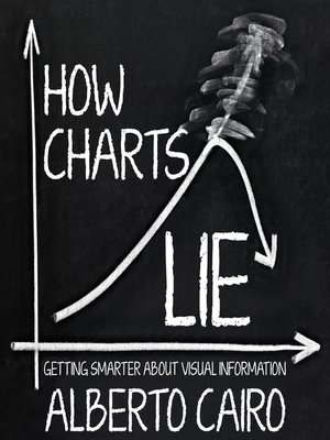
We've all heard that a picture is worth a thousand words, but what if we don't understand what we're looking at? Social media has made charts, infographics, and diagrams ubiquitous—and easier to share than ever. We associate charts with science and reason; the flashy visuals are both appealing and persuasive. Pie charts, maps, bar and line graphs, and scatter plots (to name a few) can better inform us, revealing patterns and trends hidden behind the numbers we encounter in our lives. In short, good charts make us smarter—if we know how to read them.
However, they can also lead us astray. Charts lie in a variety of ways—displaying incomplete or inaccurate data, suggesting misleading patterns, and concealing uncertainty—or are frequently misunderstood, such as the confusing cone of uncertainty maps shown on TV every hurricane season. To make matters worse, many of us are ill-equipped to interpret the visuals that politicians, journalists, advertisers, and even our employers present each day, enabling bad actors to easily manipulate them to promote their own agendas.
In How Charts Lie, data visualization expert Alberto Cairo teaches us to not only spot the lies in deceptive visuals, but also to take advantage of good ones to understand complex stories.


