
Sign up to save your library
With an OverDrive account, you can save your favorite libraries for at-a-glance information about availability. Find out more about OverDrive accounts.
Share

Find this title in Libby, the library reading app by OverDrive.

Search for a digital library with this title
Title found at these libraries:
| Library Name | Distance |
|---|---|
| Loading... |
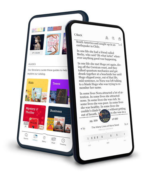
Today's library patrons are browsing the Web on a variety of devices including tablets, e-readers, mobile phones, and desktops. Responsive web design employs techniques that will enable your library's website to automatically adapt to whatever screen size it's being viewed on. Learn how to utilize CSS techniques such as fluid grids and flexible images combined with responsive design techniques such as media queries to deliver an optimal experience for your library patrons regardless of device. Design one website to fit them all.
With both beginner and expert developers in mind, this complete handbook guides the reader through the process of developing and launching their own Responsive Web Designs and introduces the craft of building multi-screen experiences. Online demos and downloadable code files are included for all projects:
Adapting your Existing Layout into a Responsive Layout – A RWD Retrofit Building a Responsive Layout from Scratch – A RWD Bookreader Creating a Responsive Contact Form – "Get a Library Card" Creating a Responsive Search Interface Creating a Responsive Single Page Application – "Mobile Feed App" Using an RWD Framework for a complete site: Twitter Bootstrap
With both beginner and expert developers in mind, this complete handbook guides the reader through the process of developing and launching their own Responsive Web Designs and introduces the craft of building multi-screen experiences. Online demos and downloadable code files are included for all projects:
Share


